“I’ll design this and export it as a PNG you can upload directly to LinkedIn.” Oh, really ???
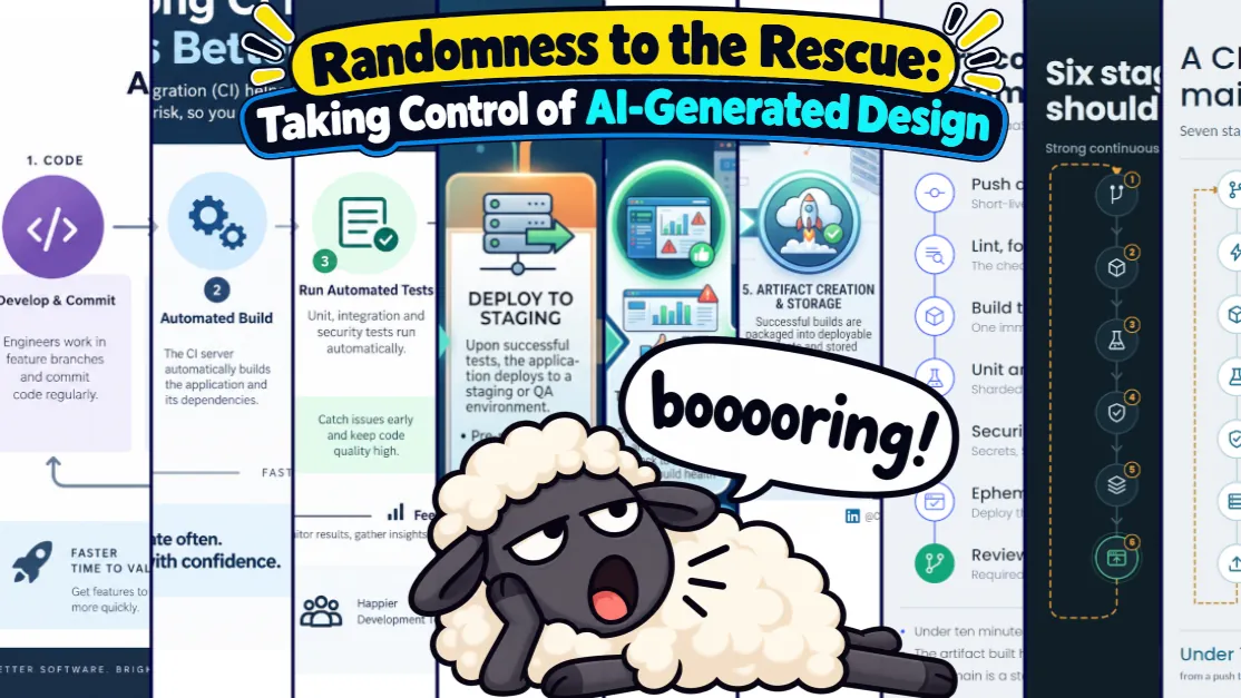
I ran an experiment: how far can you push AI image generation before it's faster to just drag things around yourself? The trick isn't a better prompt. It's knowing when to stop.
Tbh, I'm not even reading anything that's illustrated with these low-quality, half-baked, AI-generated images. I'm not anti-AI, just an AI realist. I'm also no design expert, I just prefer to view diverse, readable, stylish, beautiful, and symmetrical infographics where the intention was clearly to help me understand something.
I figured I'd offer some tech-focused approaches to sorting out at least some of these problems. It turned out it's not that easy at all.
Let's go down a rabbit hole together and see how we could solve this problem with widely available tools like Gemini, Claude and/or ChatGPT. My goal is to show a fast and simple method exists that doesn't require any extra subscriptions and still gets something better than the default:
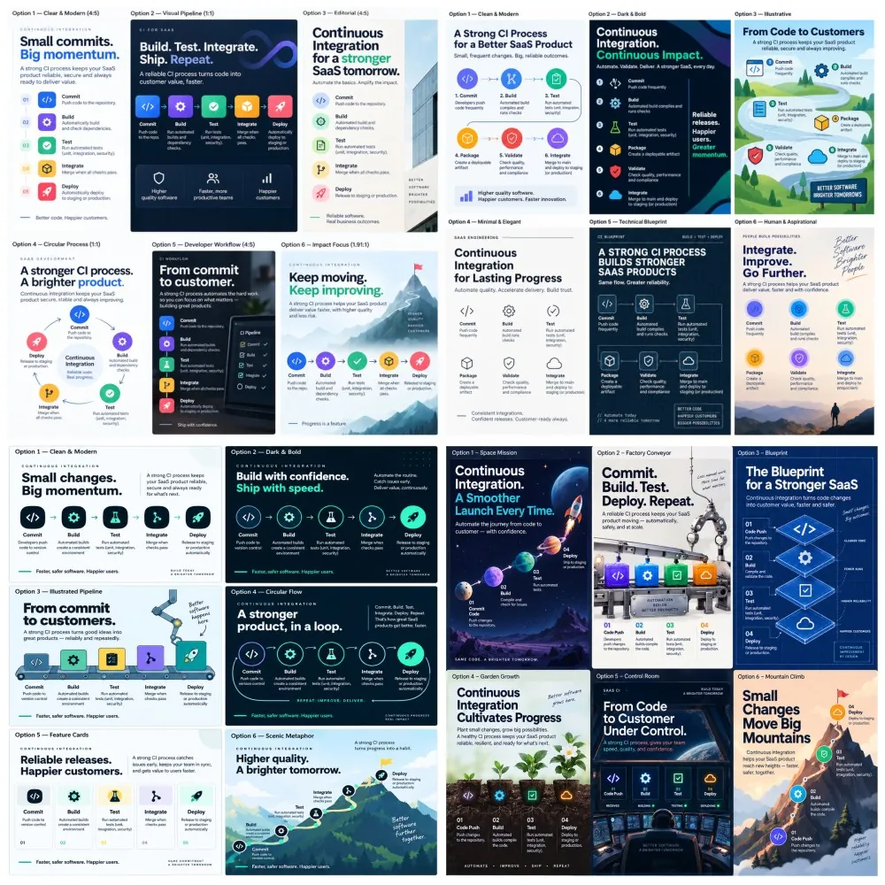
Diversity
To demonstrate this, I've asked the following from all of them:
Create a PNG image for a LinkedIn post that explains a strong CI (continuous integration) process for a SaaS product. Use icons to represent each stage of the process. It's aimed at a professional audience.
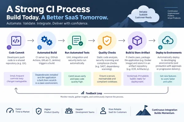
It's good, but it looks like the ten thousand other images I see every day. Boring.
Random to the rescue
You could do this properly and create a design system or give detailed instructions. However, to keep the effort low, you could generate a lot of random options and then pick one you like from the randomly generated images. So let's run:
Give me 6 random options.
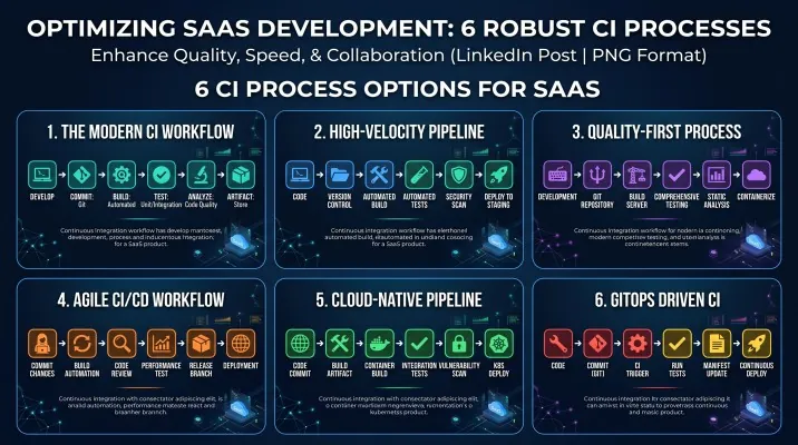
Well let's not give up just yet. Let's be a little more specific:
Before doing anything:
- Run a shell script to generate a random 96-character alphanumeric string that doesn't read as a hex value, and derive a design system from it: color palette with hex values, typography, spacing and grid, shape language, and a one-sentence tone.
- Say in two or three lines what you saw in the string and how it shaped the choices. The seed informs styling only, never the content, and never appears in the output.
- Save and label the design system for reuse.
- Recommended image sizes are: 1080 x 1350 px (4:5 ratio), 1080 x 1080 px (1:1 ratio), and 1200 x 627 px (1.91:1 ratio).
- The brief sets the bounds (audience, platform, legibility), and the seed picks a direction inside them.

Generate one image with six different labeled design options, and make sure to re-run the seeding and design process for every option. The image will be used for a LinkedIn post that explains a strong CI (continuous integration) process for a SaaS product. Use icons to represent each stage of the process. It's aimed at a professional audience.
The ask can be more specific, give it more keywords as much information as you can.
Magic:
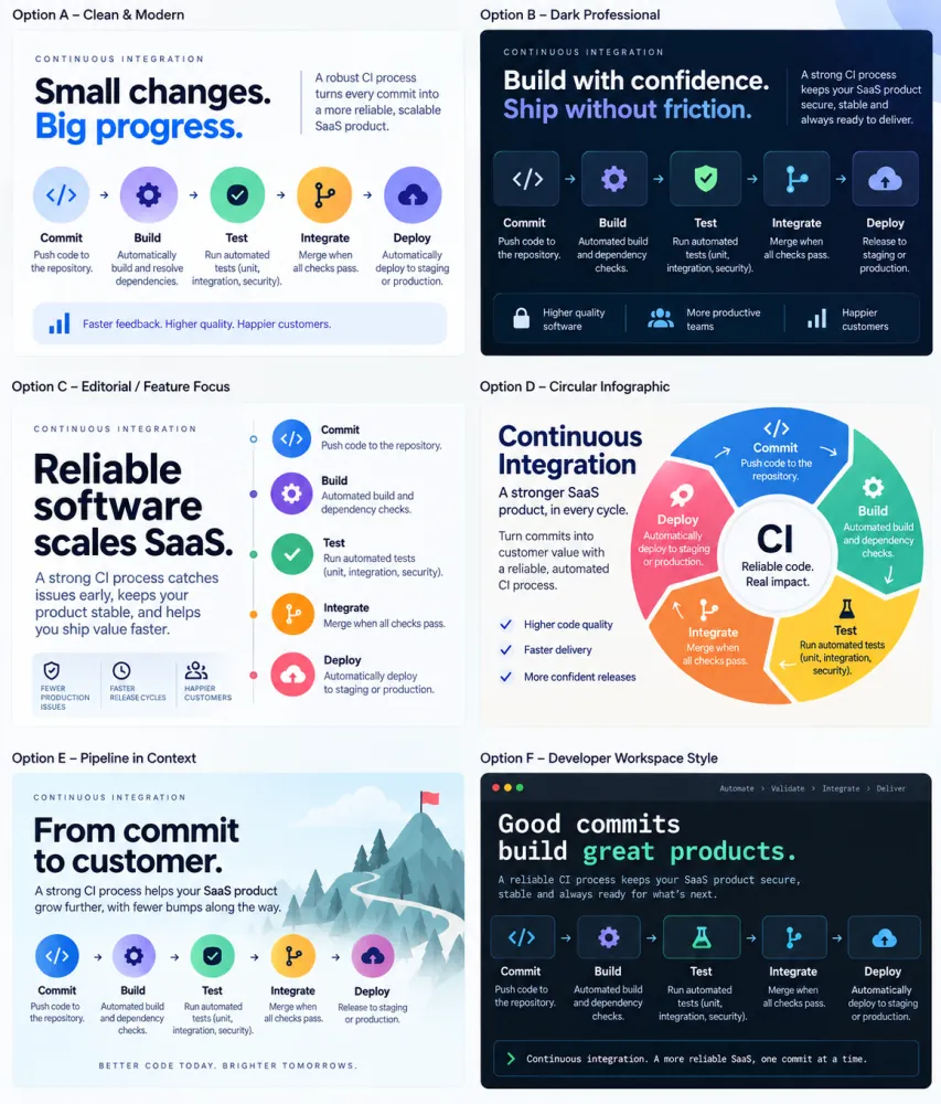
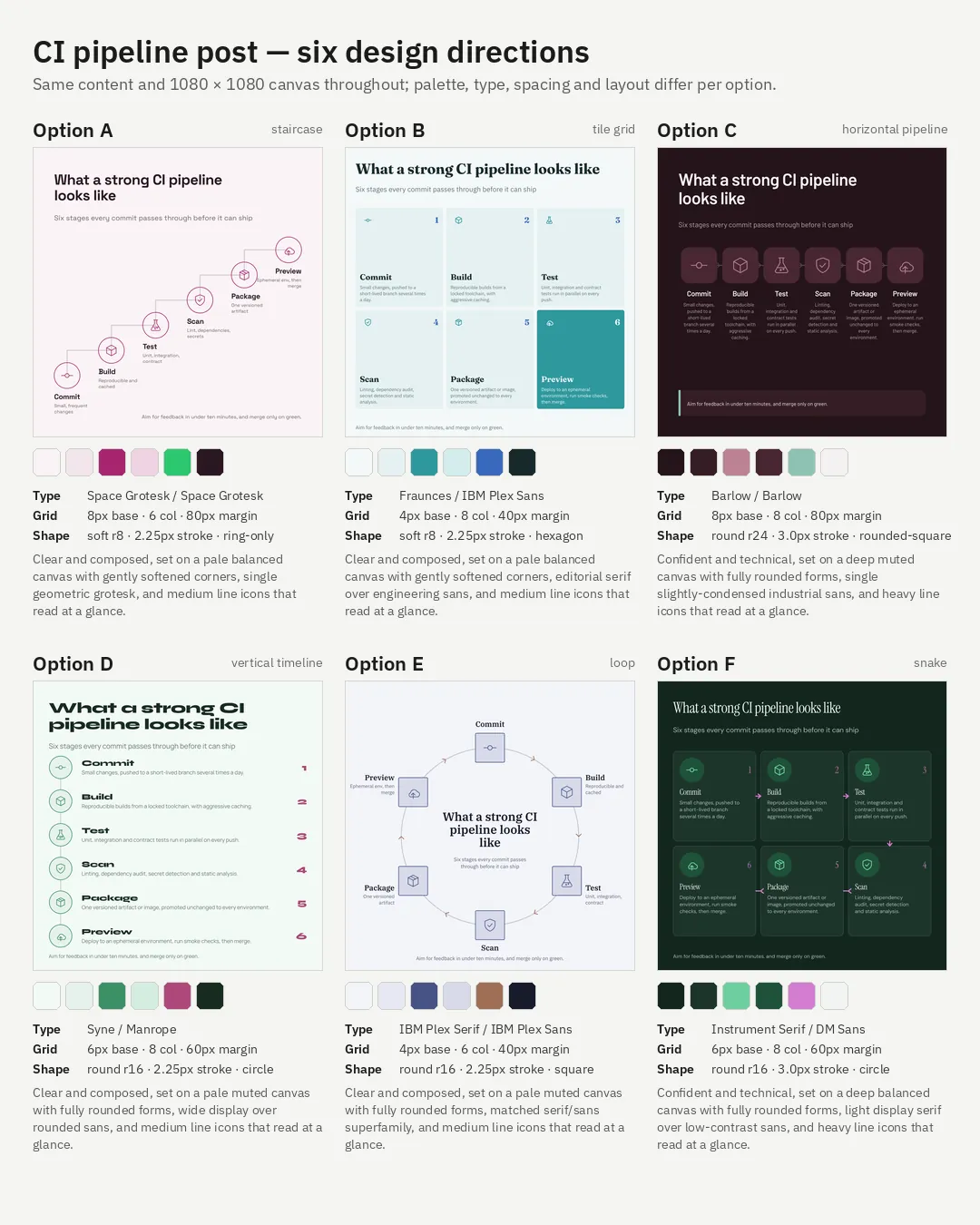
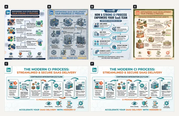
We now have better options to choose from and we can re-run these and new variations will appear. I think the images Gemini generated were more readable but it still drifted at every prompt:
Claude is trying to code its way out of the situation (we'll talk about this later), so in this setup ChatGPT looks like the clear winner to me. I like Option E, with the mountain, but the text readability is bad, so let's figure out why.
Readability
I've cut a few random parts from one of the images ChatGPT generated and played around with the hue, saturation, and exposure values to make the problem more visible:
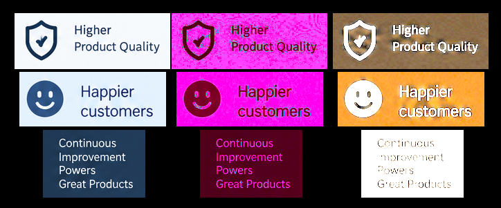
My eyes get tired just looking at these. Is it just me?
I need to eliminate this somehow. One piece of online advice is to add this to the prompt:
flat vector illustration, solid single-color background, no texture, no gradient, no grain, clean edges, minimal icon style
I'll try it out just to see whether not stating the obvious is the issue here:
It's definitely better, but not good enough. We'll need some explanation for this.
Quality
The next step is to choose a layout. But wait, what's up with these strange icons?

Latent representation
Modern image generation services use iterative generative processes involving latent or other internal representations. The exact architecture and process depends on the model.
Imagine you have a big box of LEGO bricks, all mixed up. Before you build a car, you have a picture of it in your head, not the placement of every brick, just the idea of it: it has 4 wheels, doors, front bumper. The idea itself is enough to build the whole thing.
A computer does the same trick. Think of a latent representation as a compressed internal representation of information relevant to the model's task. It isn't literally a list of features, it's just a useful analogy for understanding the concept.
Now let's compare how well can Claude generate images ... an easy one:
Generate an image of a sheep and a dog!
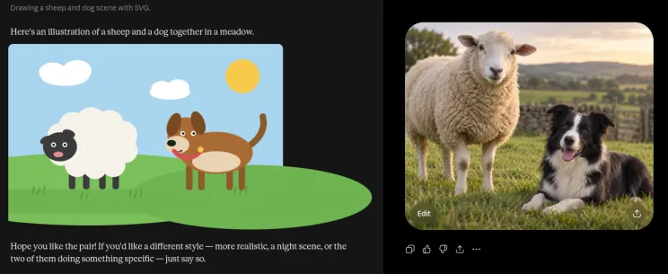
Well the choice really comes down to the audience you're trying to reach, right marketers?
Claude is trying to code itself out of the situation, notice it's generating an SVG file.
An SVG is a special kind of drawing that never gets blurry. That's because instead of saving the picture as lots of pixels, it saves it as instructions, like "draw a big circle here for the head, two on top for the ears." I'm not lying, and I can prove it to you:
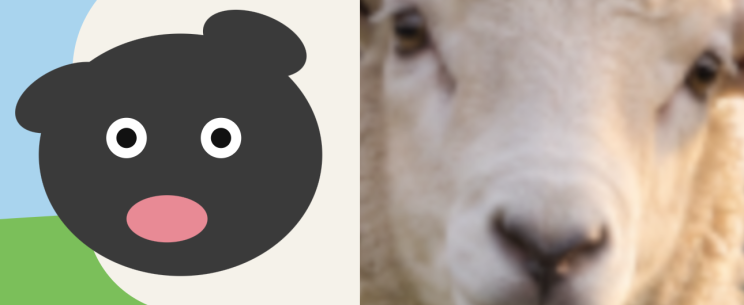
We'll see why this is important later on, not the sheep, the SVG format :)
A good idea would be to give ChatGPT a set of fixed bricks, like fonts, icons, or other images, and let it play around with them.
"Being more specific"
The standard advice is that your prompt isn't specific enough.
I've chosen version E because it's the one that gives us a big headache later. It has some image artifacts I want to preserve.
Onward, then, to the battle GPT! Let's go forward with option E!
So let's apply some really easy fixes: we'll give it a few bricks to outsmart this thing, and get some design rules out of it that we can set in stone for later use:
Use option E applying the following steps:
- choose an open-source font for the text
- choose an open-source icon font
- define a symmetric 4:5 ratio grid layout and use that to align the contents
- display the choices as text
- export the design system into a JSON file for later use
- generate the image
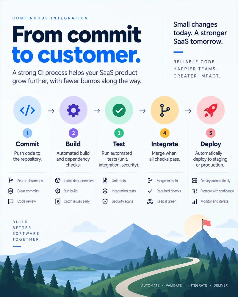
Ok, well... I could live with this... But if you zoom in now, the bottom icons and backgrounds are still noisy, full of visual artifacts. This is how it looks after playing around with the saturation:
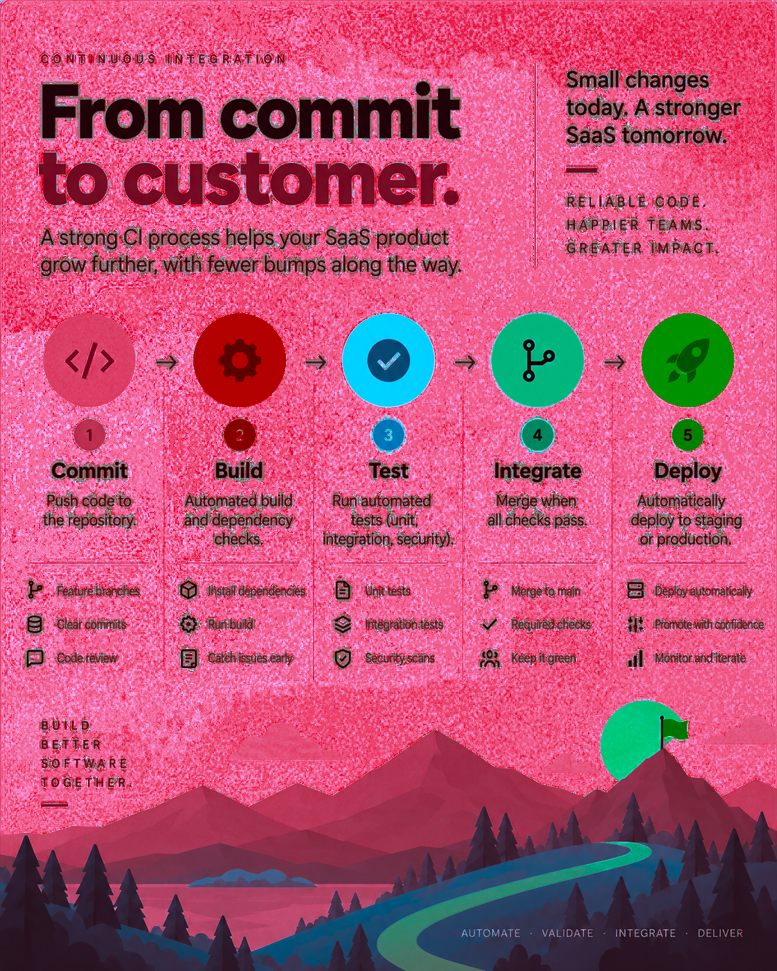
You iterate on the design, and even though you instructed it to use the open-source icon set, you still get these strange icons back after a while. The drift is there again:

The background and the images are good enough, however it's like we're constantly drifting away with every prompt.
As mentioned before, when an image is modified the model is not operating like Photoshop, its goal is not to preserve every pixel. Instead, depending on the model and the request, parts of the image may be regenerated or altered.
From the output provided it seems the model does a good job on illustration but the text and icons don't look that good. These image models can use supplied references, but it's clear that exact preservation is not guaranteed.
So what's the solution, do we need another tool ???
Solution
A solution would be to preserve a good state, generate the image assets (backgrounds or any other objects), and then convert them into something that's easy to edit in a lossless way, so we get the best of both worlds:
Use option E, applying the following steps:
- Define a symmetric 4:5 ratio grid layout and use it to align the contents.
- Generate the image (background, mountain, flag) without text as a transparent PNG file.
We review the image:
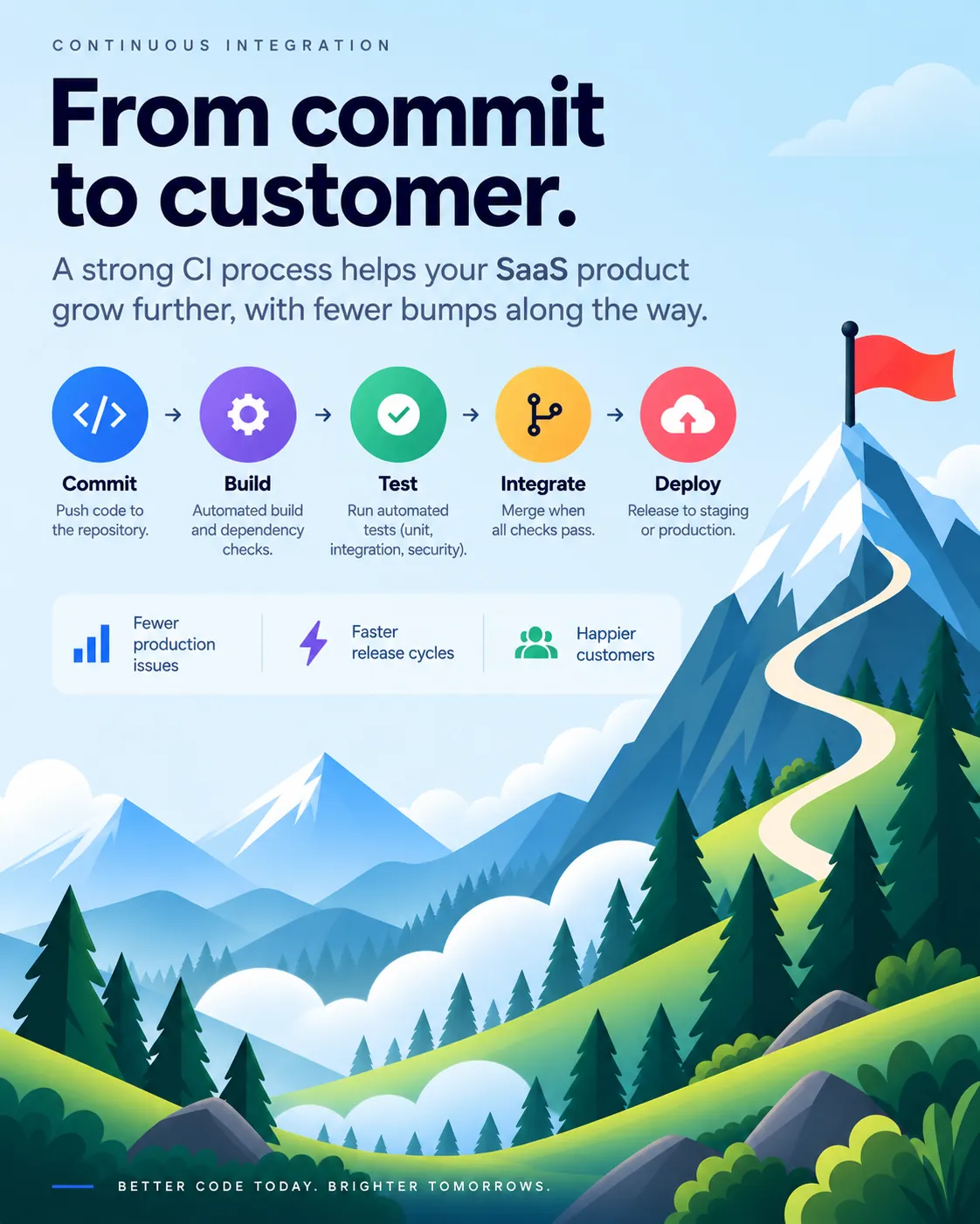
Now I could prompt it to change the text or fix the alignment of the elements, but instead I'll focus on the parts I want preserved. This is a small rescue mission: keep the mountain with the little flag on top and make the background area transparent. So we ask it to dump the following:
Use the generated option E image, applying the following steps:
- Generate the image (background, mountain, flag) without text as a transparent PNG file.
- Choose an open-source font for the text.
- Choose an open-source icon font.
- Export the design system to a JSON file for later use.
We have the design decisions as a structured text (JSON) file and the background image at hand.
Now you could continue the process with ChatGPT, but I found that Claude is way better at writing code. Upload the two files to Claude or Claude Design and kick it off with this prompt:
Use the generated image as a basis for transforming its contents into an HTML file by following these steps:
- Keep the layout, aspect ratio, text alignment, and font styling and sizes. Make sure the default background color is set and the background image is fully visible.
- Use the generated JSON design system file and download the font packages.
- Make sure to embed every asset: the transparent PNG background image and the fonts.
- Use the specified icon font as the authoritative source for every icon. Do not redraw, approximate, reinterpret, or invent icon shapes.
- Do not redraw or come up with new parts to illustrate.
- Verify the HTML file for correctness before posting it.
Why HTML? Because the tooling for it is so much better in Claude, and it's faster to iterate on. After a few comments, I reached this point:
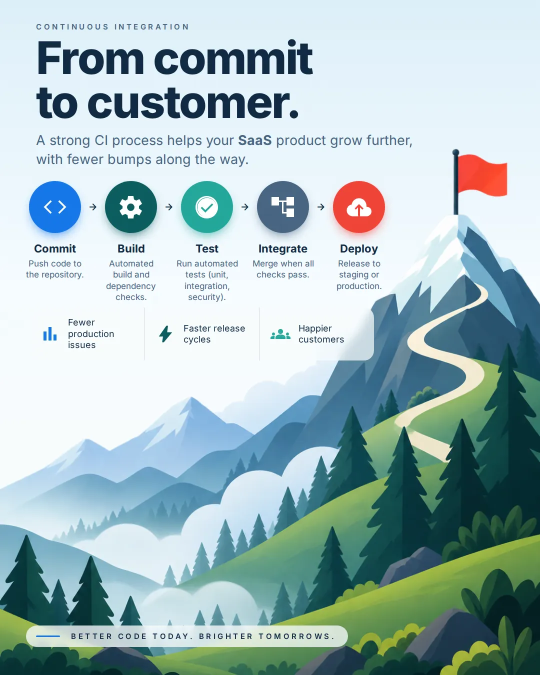
It's not perfect, but it's diverse and readable. Now I need a way to take it over from the LLM.
The takeover
You can use Claude Design to get better control over the output, or you can request conversion to an SVG file directly. After that, you can continue editing the file with an editor.
SVG files can then be imported into vector-graphics editors like Adobe Illustrator and Inkscape. Don't forget to install the same fonts locally before importing, like I forgot to :D
I've fooled around with the layout a little bit in the editor just to demonstrate that this works:
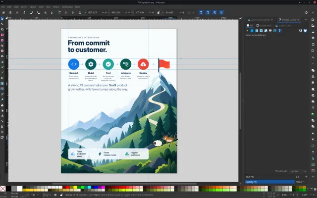
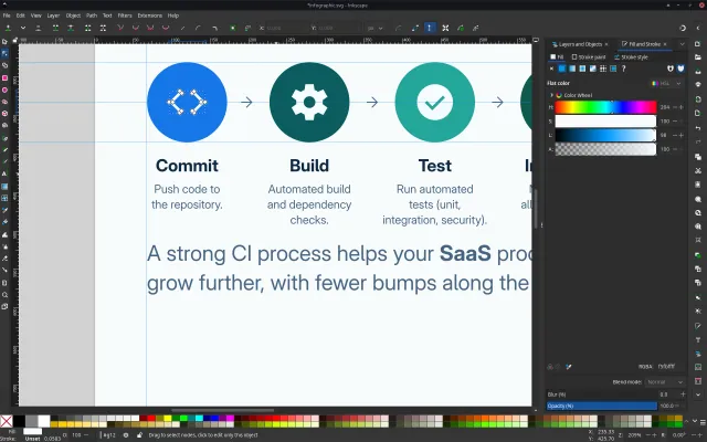
This is still far from a professionally designed material, but it's better than what we started from, and at this point you can start working on making it even better.
The secret ingredient that will make this better is probably ... YOU!
I hope this helps!